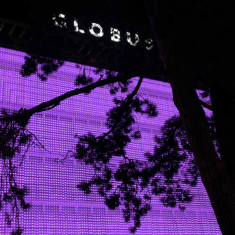
 In Dec 2020 Pamela Rosenkranz designed a Christmas decoration for department store GLOBUS in Zurich. The installation called „Living Colors“ was inspired by the „Brainbow“ project from Harvard University, where scientists managed to mark nerve cells with the RGB color system. Consequently, each new thought resulted in a new mixture of the three primary colors red, green and blue. The installation of Pamela Rosenkranz takes the idea and changes colors accordingly, reflecting the thoughts of the people on the street. The work is also accessible on the mobile phone via qr-code. I really like this idea because on the mobile screen what most people perceive as the “Christmas decoration” turns into a digital artwork...check it out:
https://livingcolors.globus.ch/ Source: https://bellevue.nzz.ch/design-wohnen/den-globus-in-zuerich-ziert-ein-kunstwerk-von-pamela-rosenkranz-ld.1587887 Comments are closed.
|
Viviane Mörmannis an art specialist, curator, educator and project manager. She is the author of the corporate art index. Archives
|
 RSS Feed